


In today’s real estate climate, agents need a personal brand more than ever. Rory Vaden said it best when he described personal branding as “the digitization of your reputation.” But how do you “digitize” the reputation you’ve built? When it comes to building your real estate brand, having experience and expertise doesn’t matter if people don’t even know you exist. Here’s the good news: I’m breaking down the exact steps you need to take to build a magnetic personal brand so you can stop chasing clients and start attracting them.
What Is Real Estate Branding & What Makes a Great Brand?
Simply put, real estate branding is the consistent techniques and strategies professionals use to market their services, build authority in the real estate space, and attract clients. As a senior brand strategist at Sell It, Owner of Elevate Design Studios, and host of the podcast Not Nice. Clever, I’ve worked with hundreds of agents nationwide and beyond on building their personal brands. My mission is to help real estate agents learn how to leverage realtor branding to create a life and business they love.
Ever wondered what makes great branding? It’s the magic that compels you to grab Kellogg’s Frosted Flakes instead of the generic store brand. Why? Because Frosted Flakes are not just cereal, “they’re grrreat!” And who told you that? Tony the Tiger, your childhood companion.
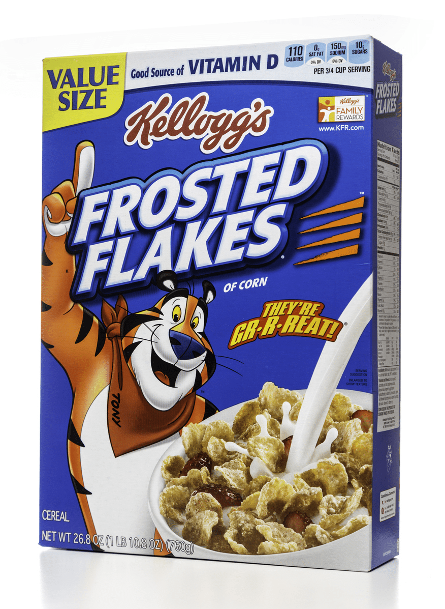
You’ve watched him on TV, sharing breakfast moments with kids ready to tackle the day. He’s dominated billboards off local highways, and when you spot him on the cereal aisle, it’s like seeing an old friend. What’s the appeal of Tony? He’s not just any tiger; he’s 6’3″ of authority and approachability, a figure both kids and the young at heart can respect and admire. Even though those generic Sugary Flakes might taste just as good, there’s a trust factor with Tony that keeps us loyal.
So what does this teach us? If you want to build a loyal following, you have to create a magnetic brand.
Elements of a Magnetic Real Estate Brand + Examples
It’s easy to think of a real estate brand as a logo or catchy tagline. While those elements may be part of your brand, they are definitely not in and of themselves your brand. There are five key elements that every real estate brand needs. Below, I’ve shared each aspect along with real estate branding examples. Use the guiding questions and the examples to begin to craft your personal brand.
You might be surprised at how much you already know about your real estate branding that you aren’t leveraging yet. While you may know these things about your brand, the bigger question is, are you sharing this with your audience in a meaningful way?
Let’s dive in.
Element 1: Your Brand Story
How did you get here? What transformation happened that has led you to this place? Why should people trust you?
Think back to before you went into real estate and reflect on the journey it took for you to get here. Maybe you were in a whole other industry, or you were drawn to real estate right out of high school. Name the reasons you entered this industry and the skills you learned before becoming a real estate agent. All these things brought you to this point, so add them to your brand story. People love to hear stories—don’t be afraid to tell them yours!
Example of a Great Brand Story
Ryan Serhant exemplifies the power of a compelling brand story. Whether you’ve followed his journey on Million Dollar Listing, dove into his insightful books like “Brand It Like Serhant,” or stumbled upon him while scrolling through Instagram, his story captivates. It’s the classic “from rags to riches” tale, resonating with many, yet remaining aspirational. Consistently sharing where he’s been AND where he’s going instills hope and motivation in his audience, ensuring his brand remains unforgettable, leaving the audience thinking: “If he can do it, I could do it too.”

Serhant and Inman (Source: @ryanserhant) 
Serhant representing his brand (Source: Facebook) 
Book branding with fun real estate headshot (Source: Amazon)


Element 2: Your Brand Values
What do you stand for? What do you believe? How do you serve your clients?
Your core brand values are the business beliefs you hold near and dear to your heart and wish to instill in all your clients. Think about your brand values as the integrity and backbone of your business—things like transparency, teamwork, expertise, diversity, and quality service—the qualities you would want in a real estate agent. Write them down and prioritize the values that are most important to you.
Example of Great Brand Values
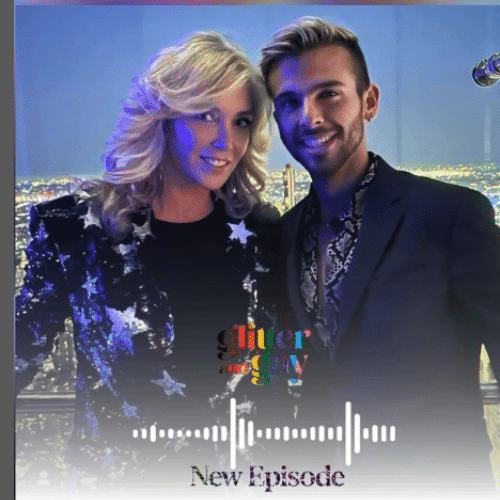
Glennda Baker, Realtor extraordinaire in Atlanta, Georgia, has built an incredible personal brand rooted in her values. Her content feels effortless to the viewer because it’s rooted in radical authenticity. Her ability to tell stories that draw you in, lean into vulnerability (have you listened to Glitter and Gay?!?), and show off her real estate prowess while maintaining her flavor of southern charm is captivating. Her brand calls in the right people for her and repels the rest. And just in case there’s any confusion … she’s been doing this since “Jesus was a baby.”
Glitter and Gay podcast (Source: @glenndabaker) 
Helping clients move (Source: Facebook) 
Relationship marketing podcast (Source: ReminderMedia)


Element 3: Your Brand Attitude
Is your realtor branding humorous or proper? Playful or Zen? What’s the overall vibe?
If you’re unsure about your overall vibe, here are two things you can do.
- Send a text to six people, including two friends, two colleagues, and two past clients. Ask them to describe you in three words. See if there are any themes that you can lean into. And if you don’t like the words they chose, decide to show up differently and choose the words that resonate with who you are becoming.
- Write a list of things you’re not. Sometimes, it’s helpful to work backward. I’d likely write that I’m not stuffy or proper. Knowing what I’m not can help me hone in on what I am.
Example of a Great Brand Attitude
Shawn King, the witty Realtor from Toronto, is known for his humorous and satirical approach to real estate content. With his innovative editing style and comedic skits, he effortlessly connects with his audience, making himself instantly approachable. Shawn’s content is not just hilarious but also remarkably relatable. He possesses a knack for transforming what could easily be seen as mundane real estate topics into captivating and engaging content. With each post, he keeps his audience on their toes, leaving them eagerly anticipating his next creative twist.


Element 4: Your Unique Value Proposition
Why should people choose you over your competition? What makes you better?
This element requires you to take a good, hard look at yourself and your competitors. Other realtors can assist clients with buying and selling a property, so you need to decide what makes you unique from the other real estate agents out there. Your unique value proposition (USP) ties into your values. For example, if you value expertise, your USP could impart real estate education to your clients throughout the transaction.
Example of a Great Unique Value Proposition
Meet Marie Keaney, a SoCal Realtor with a unique twist. Formerly a teacher, Marie’s passion for education shines through in her work. That’s why she’s launched the innovative Teacher Give Back Program. When you choose to work with Marie, she donates to the teacher of her client’s choice. It’s a heartwarming initiative she showcases regularly on social media, sharing touching stories of the teachers impacted. Marie’s blend of real estate expertise and philanthropy is the defining factor that sets her real estate agent branding apart.

Teacher Give Back in action (Source: @homesbymarie) 
Marie meeting up with a former student (Source: Facebook) 
Client advice (Source: LinkedIn)


Element 5: Your Brand Look & Feel
What colors and fonts will you use? Is your logo modern and minimal or in your face?
While it’s tempting to pick your favorite color and fonts, it’s necessary to think outside the box to choose a color and font that will stand out visually and against competitors. Once you’ve decided on your business name, test multiple color and font options on real estate brand marketing materials to see which are visually appealing (especially from a distance). Print out competitor materials and place them next to yours to have friends and family pick the most standout look and feel to ensure it’s yours—if not, change it up!
Example of a Great Brand Look & Feel
Paige Fingerhut Charnick, the broker-owner of Beach Equities in Long Beach, CA, recognized the importance of aligning her brokerage’s visual identity with its exceptional service. Established in 1972, the brokerage underwent a logo refresh in 2014, but Paige understood it was time for a fresh update. She realized that as her brand messaging evolved, so should its appearance.
Drawing inspiration from the California coastline, Paige worked with Elevate Design Studios to curate a color palette that captures the region’s essence. With a keen eye on honoring the professional legacy of the brand, they carefully selected fonts that exude sophistication. Introducing a sun icon infused the brand with a renewed sense of vitality and energy. This transformation highlights the vital role of a visually compelling identity in ushering in a new era of an established real estate brand.

How to Build a Brand With the 3C Method
Knowing each of the elements of a real estate brand is helpful, but how do you go deeper? After working with hundreds of agents nationwide and beyond, I’ve found that you have two choices: You can build your personal brand with intention, or consumers will assign one for you.
If you’re anything like me, you would like to be in control of your future, which means you need to control your real estate branding. But where do you start? I’ve created the 3C Method to Magnetic Personal Branding to build your real estate brand, and I’m breaking it down for you here.
Before you build that website, hire a logo designer, host that next event, or write your brand story, sit down and think through the 3C Method outlined below. This is the not-so-sexy part of branding that is absolutely crucial to building a brand that actually connects.
The 3C Method to Magnetic Personal Branding
Clients
Content & Collateral
Collaborations & Features
Clients
Building your real estate brand begins with defining your target audience and intimately knowing their problems. When you’re clear about your niche audience, you can make informed decisions on how to curate your brand.
Ask yourself these questions to clarify the clients you want to work with.
Who do you work with?
- What do they want?
- What are they struggling with?
- What do they care about most?
- Demographic Information
Why are you the one for them?
- What experience(s) do you have?
- What have you been through?
- How do you serve your clients?
- What makes you special?
For instance, if you find that your passion and realtor branding resonates best with millennial first-time homebuyers, dig into that niche. Know about their fears of not being able to afford to purchase a home or save for a down payment and lean into that.
Hone in on your experience working with these individuals and answer your client’s questions before they even ask them with content that demonstrates you understand their struggles. Share stories of past clients like them. All of these things are possible when you know who you’re talking to and understand what you bring to the table.
Content & Collateral
Sharing content that documents the work you’re already doing will amplify your brand. Consistent content and marketing ideas accelerate the trust-building process with your audience and build brand awareness. Use content to share your unique approach and perspective and to craft the narrative of who you are and how you can help.
What type of Content will you create?
- IG Reels/Stories
- YouTube videos
- Podcast episodes
- TikTok videos
- Facebook posts
- LinkedIn articles
- Email newsletters
Collateral Examples
- Booklets/Brochures
- Buyer’s Guide/Seller’s Guide
- Listing checklist
- Presentations
- Flyers
Suppose your niche is working with individuals searching for 55-plus communities. In that case, you might lean more toward creating collateral like flyers and postcards than posting on platforms like TikTok and Instagram, as only 6.3% of TikTok users are 55-plus years of age. However, direct mail in this demographic shows that 50% of Boomers prefer direct mail. Once you know your first C (clients), tailoring your next C (content and collateral) becomes much easier.
Collaborations & Features
Growing your audience is key to building your brand. The fastest way to grow is by collaborating with brands with similar audiences and values. Seek out opportunities to collaborate and be featured within the industry and beyond.
How will you collaborate? Who will you collaborate with?
- Going live with others
- Podcast features
- Cross-marketing email campaigns
- Event collaborations
- Fundraiser collaborations
- Reel collaboration
Where will you be featured?
- Local news
- Online publications
- Print publications
- Blog posts
Real Estate Branding Tips
In today’s digital age, your online reputation is more crucial than ever. It’s not just about what people say about you in your community—it’s also about how you’re perceived online. Your digital footprint can make or break your real estate brand. That’s why managing and cultivating your online reputation is essential.
Here are some additional tips you should use:
- Gather your brand basics like your real estate bio, headshots, business cards, and slogan.
- Claim your profiles on relevant platforms like Google My Business, Zillow, and social media channels.
- Ensure your contact information is accurate and up to date.
- Regularly engage with your audience by responding to reviews, comments, and messages.
- Consistently share valuable content and showcase your expertise online to enhance credibility and shape your brand’s perception.
- Include your real estate agent branding ideas in a well-thought-out real estate marketing plan and budget for these items.
- (If you feel comfortable) Post personal photos or videos to accentuate your brand and show yourself outside of real estate.
Branded collateral (Source: Candice Carcioppolo) 
Branded business cards (Source: Candice Carcioppolo) 
Branded stationery collection (Source: Candice Carcioppolo)


By digitizing your reputation, you build trust and create a solid online presence that attracts clients and sets you apart from the competition.
Bringing It All Together
Reflection and direction are the name of the game when it comes to intentionally building your real estate brand. Remember, it’s not just about creating a logo or crafting clever slogans. It’s truly about authentically communicating who you are, what you stand for, and how you serve your community.
When you harness the power of the 3C Method to Magnetic Personal branding—clarifying your target audience, creating compelling content, and seeking strategic collaborations—you’re not just creating a brand, you’re crafting an experience that will set you apart in today’s market. So, go ahead, dive deep into your brand story, infuse it with your values, and let your unique perspective shine through.