


In an industry where relationships and personal branding matter most, a beautiful, well-designed business card truly makes you memorable. Use it at networking events, leave it with a new client, or share digital contact details—a standout business card will impress with the professionalism and personal style it exudes. I’ve gathered the top 15 realtor business card ideas that will make an impression in a crowded real estate market.
- 1. Century 21
- 2. Berkshire Hathaway HomeServices
- 3. Hilton & Hyland
- 4. The Perry Apartments
- 5. 520 Park Avenue
- 6. Brown Harris Stevens
- 7. Seven Harrison Tribeca
- 8. Fox Real Estate
- 9. One Eleven Murray Street
- 10. The Cape
- 11. 71 Wentworth
- 12. Village Properties
- 13. Kiawah River
- 14. The W Collection From Windermere Real Estate
- 15. Henshaw Fox
- Where to Purchase Your Business Cards
- Mistakes to Avoid When Preparing Business Cards
- Frequently Asked Questions (FAQs)
- Bringing It All Together
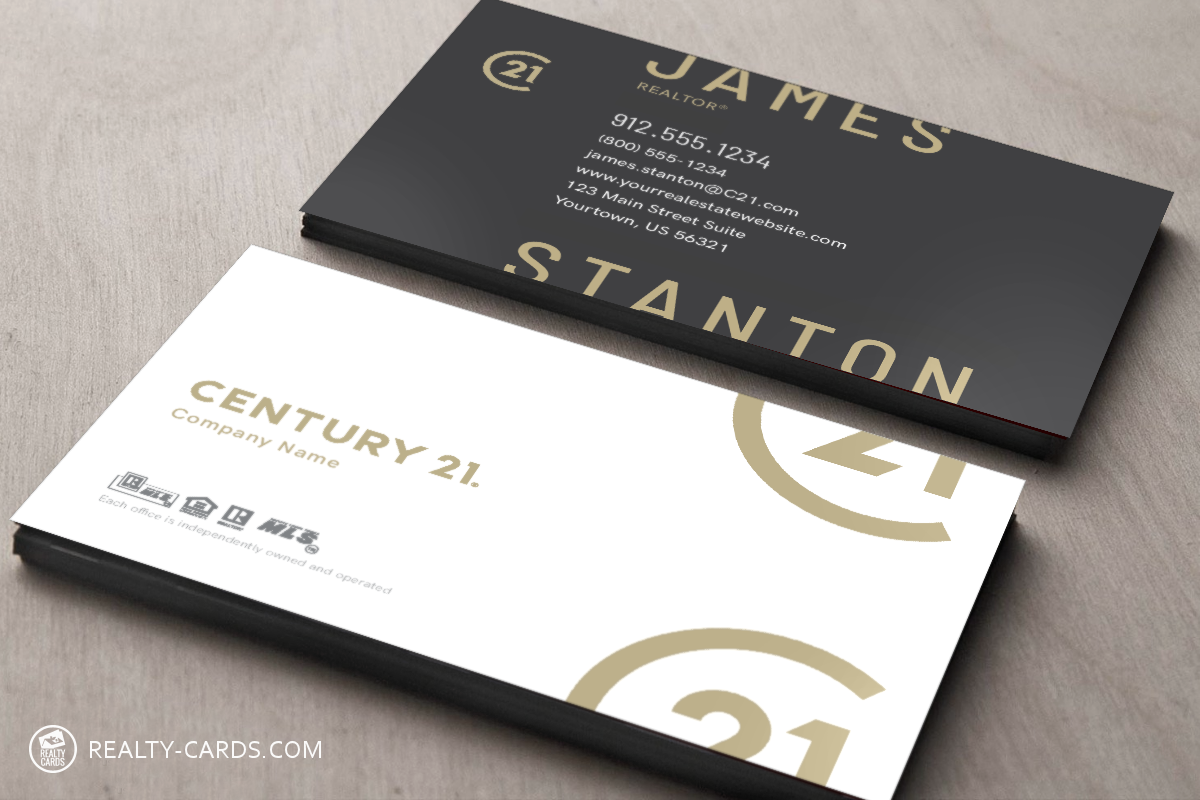
1. Century 21
-
 Why I Love It:
What has impressed me with the Century 21 rebrand is how their refreshed color palette, modernized logo, and brand mark come alive in person. The new real estate business card examples reflect the company’s evolution. They can bring subtle elegance with a hint of boldness without being too much. By aiming for sleek minimalism rather than flash elements like metallic gold, Century 21 has hit the aesthetic mark between high-end and inviting.
Why I Love It:
What has impressed me with the Century 21 rebrand is how their refreshed color palette, modernized logo, and brand mark come alive in person. The new real estate business card examples reflect the company’s evolution. They can bring subtle elegance with a hint of boldness without being too much. By aiming for sleek minimalism rather than flash elements like metallic gold, Century 21 has hit the aesthetic mark between high-end and inviting.
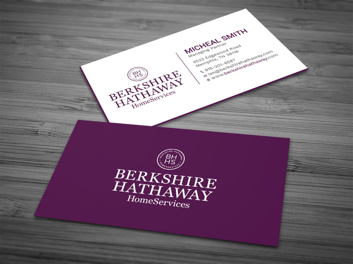
2. Berkshire Hathaway HomeServices
-
Why I Love It:
A refreshed brand identity recently occurred with Berkshire Hathaway HomeServices, which Warren Buffett founded a decade ago as his foray into residential real estate. The refreshed branding is draped in modern purple and pink hues, heralding its shift toward a more contemporary and dynamic image.
This fresh color scheme conveys a forward-looking feeling while remaining ageless in elegance, as equated with the Berkshire Hathaway name. The radiant colors make it one of the best real estate business cards, which are modern and attach sophistication to the brand.
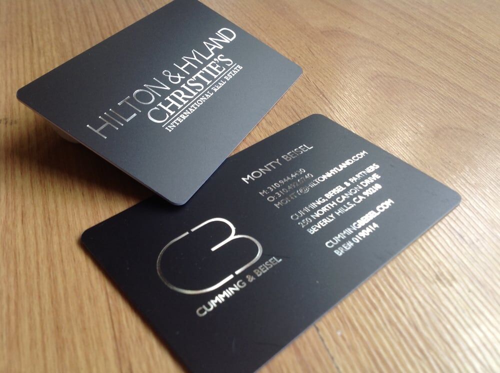
3. Hilton & Hyland
-
Why I Love It:
These unique real estate business cards for the Cumming & Beisel team at Hilton & Hyland are tailored for the upscale Beverly Hills market. These luxury real estate business cards are sleek, featuring a solid black color and chrome foil stamping. They echo the sophistication desired by clientele in this area. These business cards exude a style and exclusiveness that speaks to high-end clientele and local farm leads who appreciate the attention to detail, elegance, and polished image that aligns with their refined tastes.
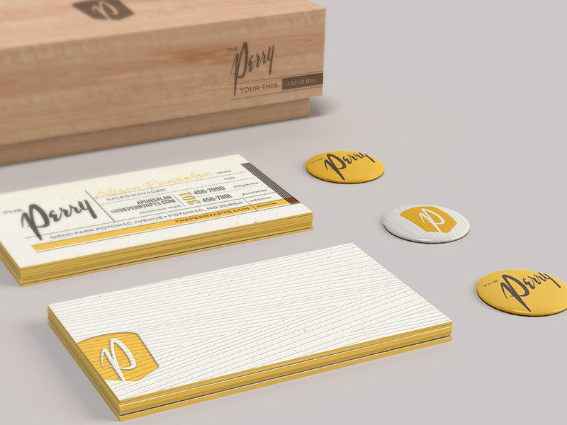
4. The Perry Apartments
-
Why I Love It:
The Perry, a luxury development in Potomac, Maryland, effortlessly captures the modern and urban aesthetic of the units. They are one of the best realtor business cards because their bright yellow color mirrors the high-end appeal of the brand with premium finishes and sleek, modern design. The attention-grabbing element is the retro-inspired branding and unique texture, which add a tactile quality that sets them apart. The combination of bold visuals and thoughtful details ensures that The Perry business cards make a strong, lasting impression, perfectly aligning with the development’s distinctive character.
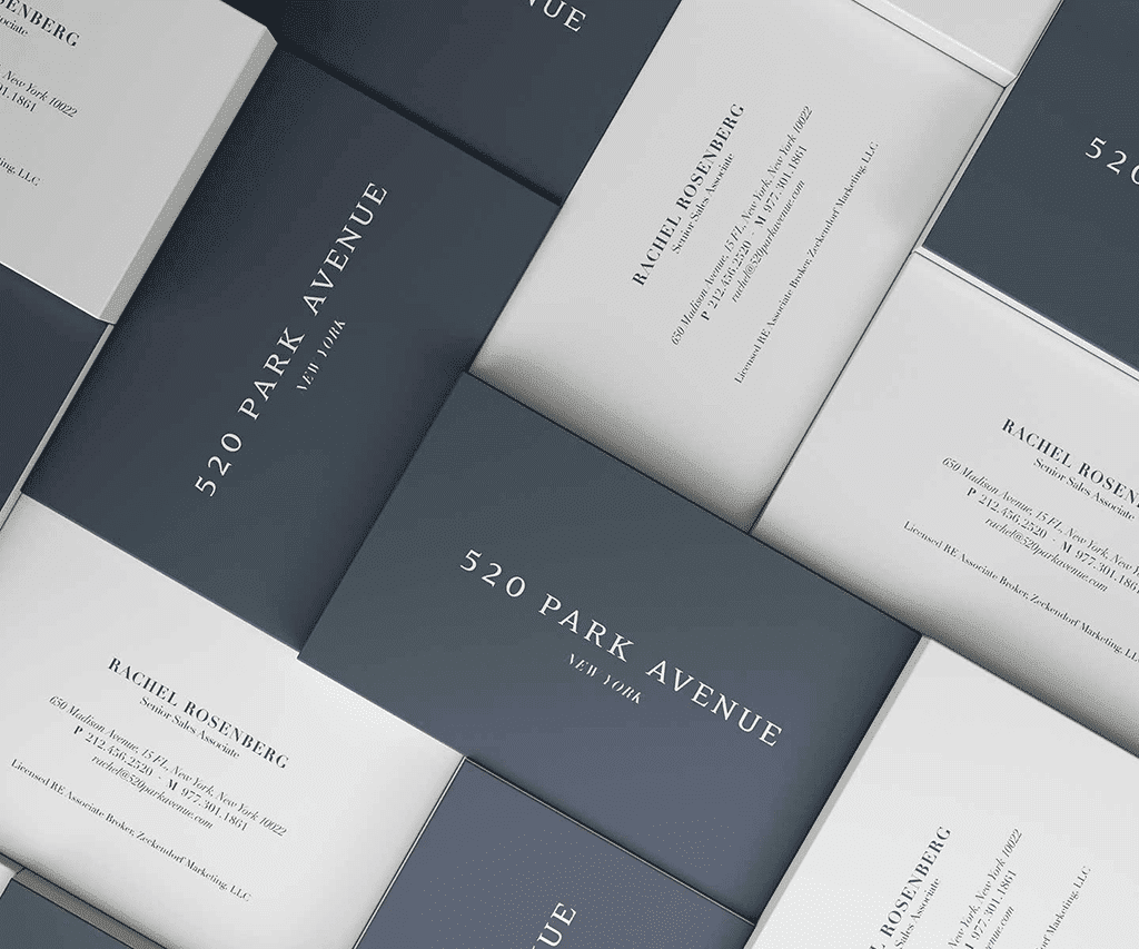
5. 520 Park Avenue
-
Why I Love It:
The Seventh Art is a real estate branding agency that designed this sophisticated business card for 520 Park Avenue. It’s one of the finest luxury residences on Manhattan’s Upper East Side. This card is subtle in its sleek design with formal typography, slate gray, and creamy white, creating a refined and polished look. They prove that simplicity executed with precision can be compelling, visually striking, and resonating for the brand.
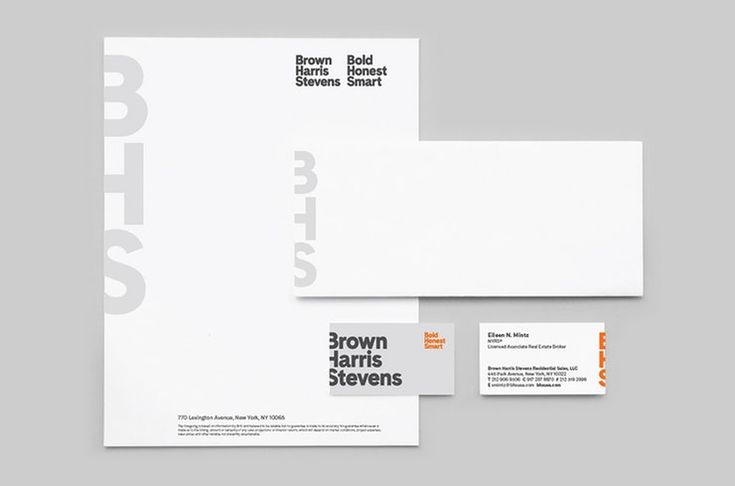
6. Brown Harris Stevens
-
Why I Love It:
With roots dating back to 1873, New York City luxury brokerage Brown Harris Stevens is a master of branding, so it’s no surprise that the real estate agent business cards for their rebranding have turned heads. These cards are bold enough to signal that the business remains at the forefront of real estate yet is understated enough to blend seamlessly into their representation of high-end luxury properties. These black-and-white business cards with a pop of orange carry the power of this luxury innovative firm but stay so true to its classic roots in a clean and confident design.
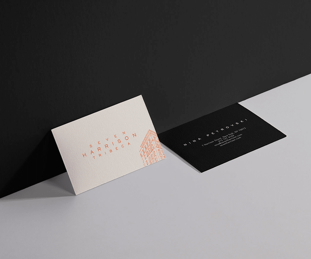
7. Seven Harrison Tribeca
-
Why I Love It:
The Seventh Art impresses once more with this striking business card design for the Seven Harrison Building in Tribeca. Set to a backdrop of cream tones, a bold, bright orange-colored design scheme is juxtaposed against the sleekness of the solid black back of the card. This combo makes for dynamic visual interest. A corner-tilted thin-line illustration of the building gives a hint of architectural detail without overwhelming the design. The card’s extraordinarily cool and effortless look captures the artistic vibe of the building and its trendy neighborhood.
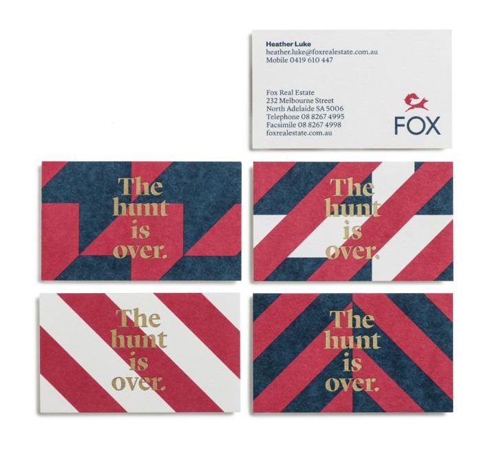
8. Fox Real Estate
-
Why I Love It:
Fox Real Estate was a little gutsy and quirky with the design of their business cards and overall branding. A bright red, white, and blue color scheme mixed with Art Deco patterns makes these cards stand out. The design accomplishes a beauty element and subtly suggests fox hunting elegance while remaining new and modern. Bold visuals are so well balanced with their messaging that this is cheeky but professional. These cards will make a real impression on anyone you hand them to.
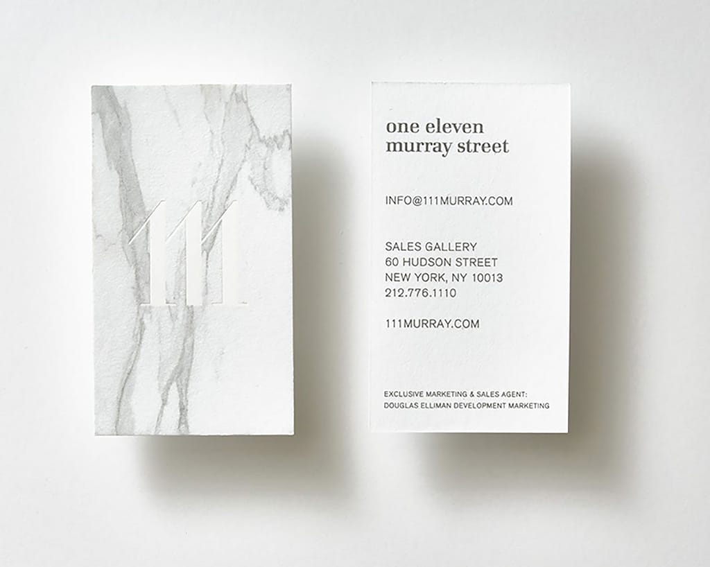
9. One Eleven Murray Street
-
Why I Love It:
Pentagram, one of the world’s top branding agencies, created these eye-catching business cards for a high-end condo development in Tribeca. There’s the unforgettable vertical orientation of the card. There’s also the marble design with an embossed logo that screams refined luxury. It strikes that perfect balance of being modern and embracing the timeless elegance that defines the Tribeca neighborhood. This approach also helps ensure that cards remain faithful to an area’s sophisticated, understated charm.
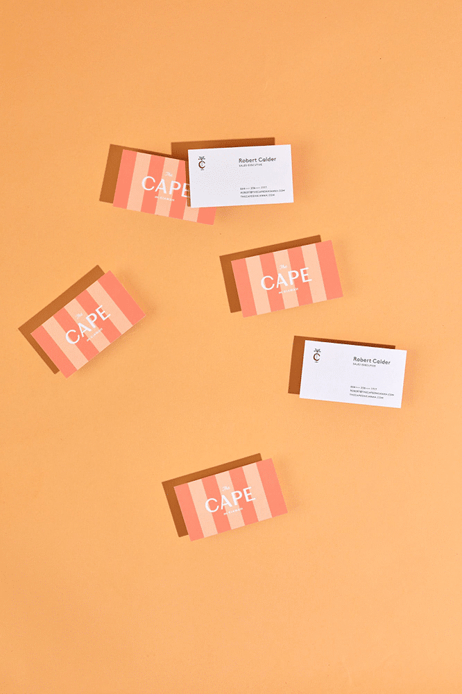
10. The Cape
-
Why I Love It:
SDCO Partners has created a business card for a new development in Kiawah Island that exquisitely reflects the essence of laid-back luxury. Catering to tastes that find elegance in effortlessness, reminiscent of destinations like Palm Springs and Palm Beach, this card oozes warmth and sophistication through its bright citrus tones. The clever sherbet-color stripes collectively create the sensation of sun-drizzled days by the sea. This playful and urbane design is right at home with the vision of luxury living amidst the relaxed ease that inspires The Cape.
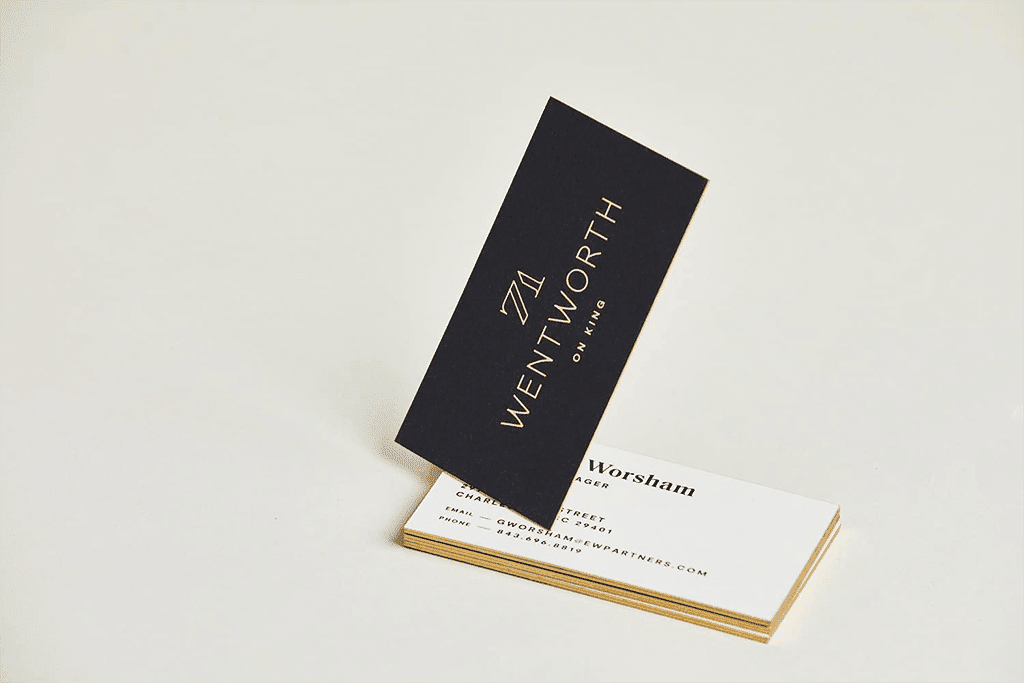
11. 71 Wentworth
-
Why I Love It:
The business cards for 71 Wentworth reflect the timeless elegance of this classic building at the heart of Charleston’s spirited retail district. Solid black cards with a center-aligned logo resonate with confidence and sophistication. This trendy design is offset with colored edges to match the logo, giving it a polished look. Printed on thick and sturdy paper, like the building they represent, these business cards communicate heritage and strength.
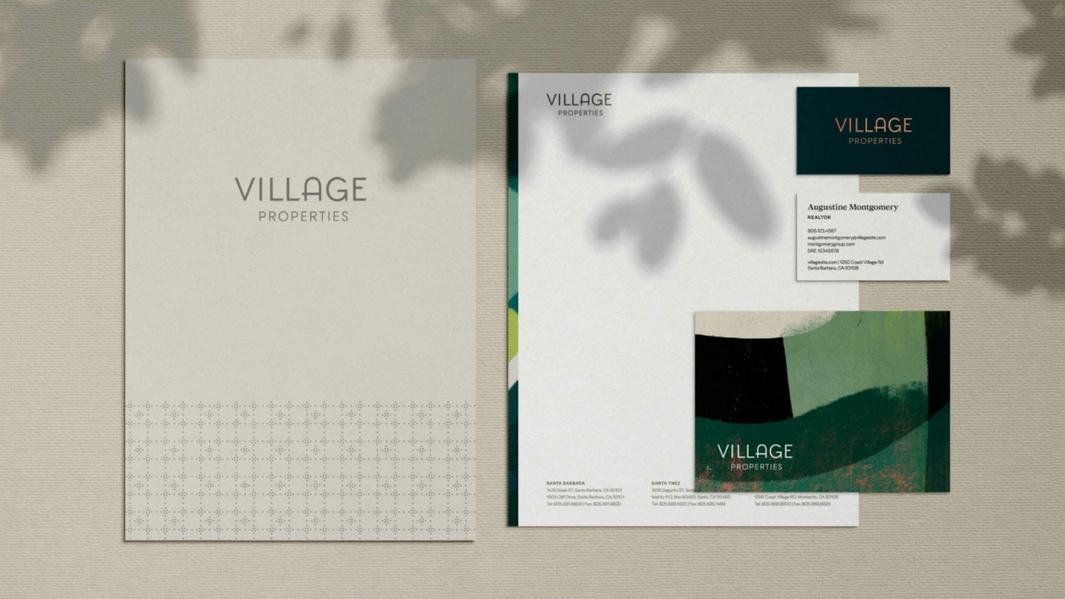
12. Village Properties
-
Why I Love It:
Village Properties of Santa Barbara, California, finished their rebranding process with 1000watt. The business cards turned out amazing because they strike the very spirit of the region. One side has a dark green fill with gold lettering that really speaks for the natural beauty and sophistication of Santa Barbara. This rich green/gold color scheme speaks luxury and provides a real connection to the lush landscapes, making the cards striking and perfectly aligned with the high-end market served by Village Properties.
13. Kiawah River
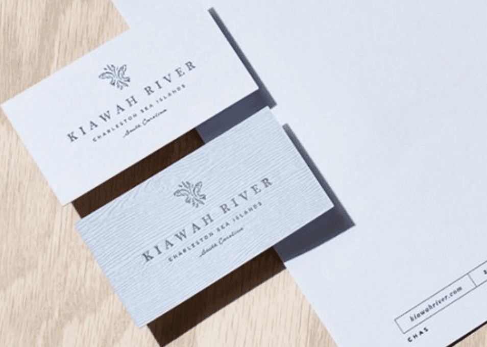
-
Why I Love It:
Kiawah River development business cards are an authentic representation of the community and its relationship with nature and languid luxury. I can’t help but love this wood texture that adds depth and character, along with subtle tones of gray and white that evoke calm and sophistication. In design, this is as simple as it gets, yet elegant, and provides tactility, much like the property’s natural beauty. The kind of thoughtfulness makes these cards a pleasure to the eye, genuinely representative of the peaceful atmosphere of Kiawah River.
14. The W Collection From Windermere Real Estate
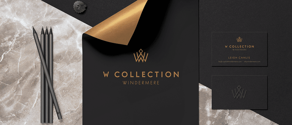
-
Why I Love It:
Windermere’s W Collection business cards scream class to rival the luxury of Washington’s waterfront estates. We particularly loved the dramatic contrast of black and bronze for a rich, refined feel in design. Debossing and foil stamping in the cards give tactile elegance to raise the brand image of exclusivity even higher. These thought-out design decisions deliver a card as prestigious as the properties it represents.
15. Henshaw Fox
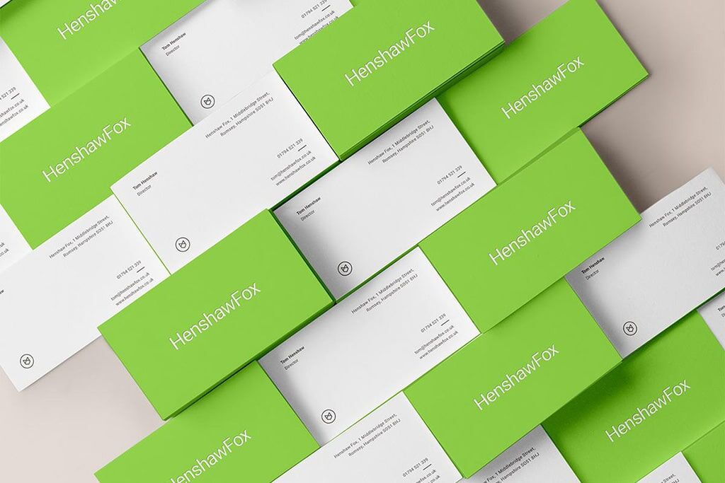
-
Why I Love It:
These real estate business card examples for Henshaw Fox make an immediate impression with their bold neon green color. This choice isn’t commonly seen in the real estate world. This striking hue sets the cards apart, conveying a sense of energy and creativity. The minimalist design on the back provides a clean contrast, while the geometric fox head logo reinforces the brand’s modern and innovative identity. Altogether, this design captures attention and stands out in a memorable way, perfectly reflecting Henshaw Fox’s unique approach.
Where to Purchase Your Business Cards
To create the best real estate business cards, choosing the right vendor will help you create the kind of professional image you want to give to your business cards. In this case, for real estate agents, it means cards that state their brand are durable and have an appropriate cost-to-quality ratio. Seek design flexibility, printing quality, price, and speed of delivery when choosing your vendor. The following are some popular choices tailored for your realtor business card ideas:
| Affordability, extensive templates, customizable options | A go-to for agents seeking a balance between cost and a wide range of design options. | |
| High-quality, premium materials, unique designs, and finishes | Preferred by agents who want standout, high-end cards that leave a lasting impression. | |
| Customizable templates, personal branding options, a variety of styles and finishes | Ideal for agents looking to personalize their cards with unique, eye-catching designs. | |
| Budget-friendly pricing, quality materials, fast turnaround | Popular with agents who need cost-effective solutions without sacrificing print quality. | |
| DIY design tools, easy-to-use interface, direct links to printing services | Great for agents who prefer to design their own cards with intuitive tools and then have them printed hassle-free. |
Mistakes to Avoid When Preparing Business Cards
Attention to detail is very important when designing the perfect business card. What might appear as a basic tool for marketing actually creates a big impression of you on potential clients. A good design will get you remembered and boost your public relations.
Whether you’re a seasoned real estate agent or just starting your career, getting it right will help you stand out in this competitive field. Here are some common mistakes you’d want to avoid when preparing your business cards:
- Overloading information: Though it is important to include key contact details, cramming too much information on the card can make the whole content very difficult to read. You might want to only include your name, title, phone number, email, and website.
- Poor quality printing: The grade of the materials or quality of printing may give a negative impression of your brand. Good paper stock and a good printer are ways to ensure that the cards will make a good impression.
- Lack of regard for design consistency: Your business card should follow through with your overall brand identity regarding colors, font, and logo. This consistency reinforces the image of your brand.
- Choosing the wrong size: A nonstandard card size may be unique, but most of all, it is highly prone to making your card a pain to carry and store. Keep it standard in dimensions so that it may easily fit into wallets or a cardholder.
- Forgetting a call to action: Add some basic call to action like, “Visit our website for listings” or “Follow us on social media.” This can make the card more engaging and be a reason for potential clients.
Frequently Asked Questions (FAQs)
A real estate business card should include all the critical information needed to contact you and effectively convey your professionalism in the quickest possible time. It should include, at the very least, your full name, job title, business phone number, email address, and website. Also possibly add your brokerage name and logo if you’re attached to a brokerage. This will solidify affiliation and add another level of professionalism to the card.
It’s wise to refresh your business card every time you make some kind of larger branding change, like having a new logo or updating your contact information or brokerage. Otherwise, refreshing your cards every couple of years will help keep your cards looking modern and in step with current design trends. Be sure to stay consistent with your personal or brokerage branding.
Although digital business cards are fast trending because of convenience and environmental friendliness, having some physical ones is always a good measure. Most clients and other experts in businesses still expect to have a physical card in personal interactions. Consider using both: physical cards for in-person meetings and a digital version for online networking or events where contactless sharing is preferred.
Bringing It All Together
Realtor business card ideas with proper design impact the impression one leaves among potential clients and fellow professionals alike. From vivid colors and inclusion of headshots to simple elegance, business cards prove that having taste in design does matter and makes a difference in brand presence. Within an extremely competitive industry, a well-made business card is the smallest investment one can make for a lasting impression.
What does your business card look like—send us a pic!