


Your logo is doing the talking long before you ever get the chance to. As a real estate agent, I’ve seen firsthand how a strong logo can instantly build trust, while a weak one can do the opposite. Adobe[1] found that 34% of consumers notice a brand’s logo before anything else, proof that this graphic creates your first impression. The best real estate logos build trust, stand out in the competitive market, and are memorable for the right reasons. They balance color, font, symbols, and simplicity to communicate personality, brand story, and professionalism. A well-designed logo will also be versatile across various marketing channels.
I’ve researched the best real estate logo examples and explained what I love about them.
 | |
 |  |
 |  |
 |  |
 |  |
 |  |
 | |
 |  |
 |  |
 |  |
 |  |
What your logo is really doing (and costing you)
Your logo isn’t just a piece of design. Before a client reads your bio, checks your reviews, or clicks on your listings, they’ve already made a judgment based on your logo. While you’re not supposed to judge a book by its cover, clients will surely judge you by your logo. In real estate, trust is everything, and that first impression carries more weight than you may realize.
A weak logo doesn’t just look outdated or incohesive, it signals:
- Inexperience
- Lack of attention to detail
- Lower perceived value
On the flip side, a strong logo does more than “look good”. It frames you as:
- Professional
- Established
- Worth your commission
Perception drives behavior. If your brand looks polished and intentional, clients are more likely to trust you, engage with your marketing, and ultimately choose your competitors.
Franchise powerhouses
These brands dominate on both national and global scales. Their logos show how consistency and clarity build trust and instant recognition. Plus, they give professionals credibility and clients reassurance.
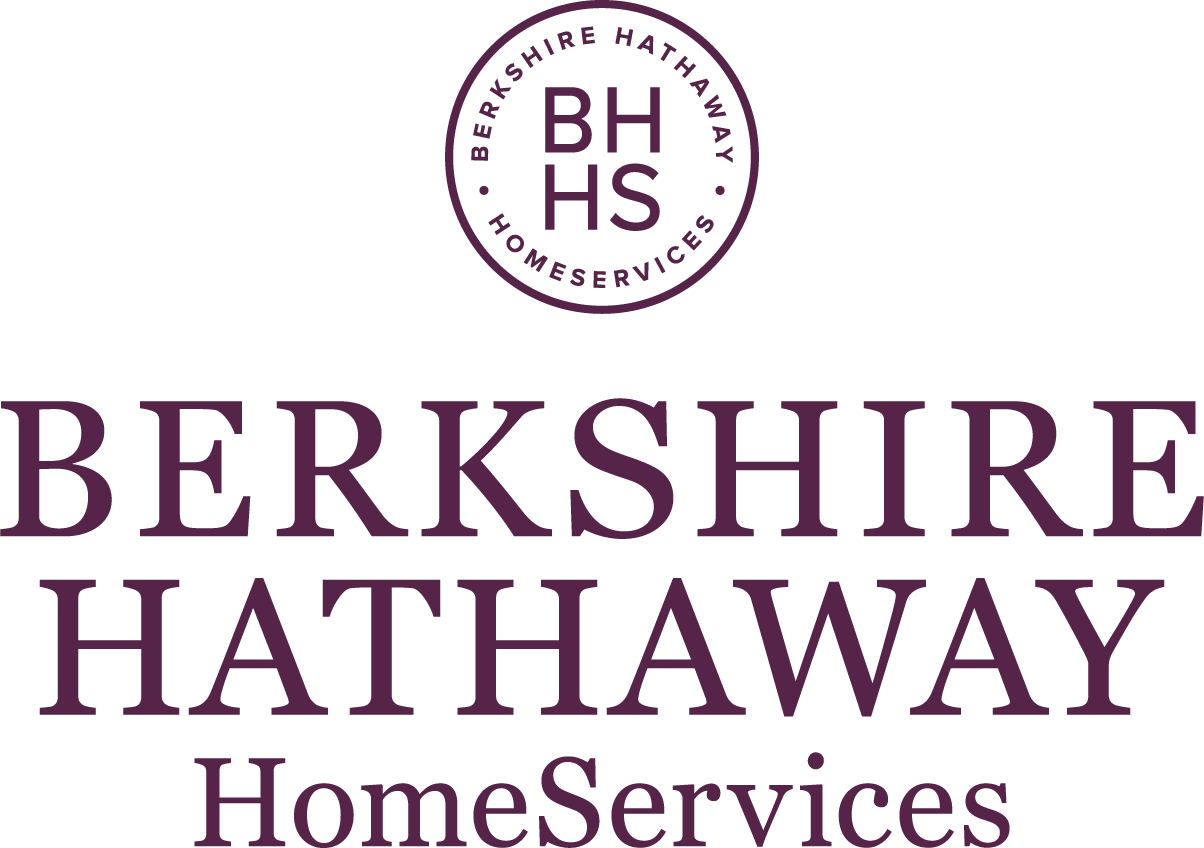
1. Berkshire Hathaway HomeServices
-
 Why I love it:
It is a traditional, no-nonsense wordmark that conveys trust. Its clean typography suggests professionalism and seriousness, qualities that buyers and sellers look for in an industry leader. Its simplicity ensures that the logo can be evergreen and projects the credibility of the brand.
Why I love it:
It is a traditional, no-nonsense wordmark that conveys trust. Its clean typography suggests professionalism and seriousness, qualities that buyers and sellers look for in an industry leader. Its simplicity ensures that the logo can be evergreen and projects the credibility of the brand.
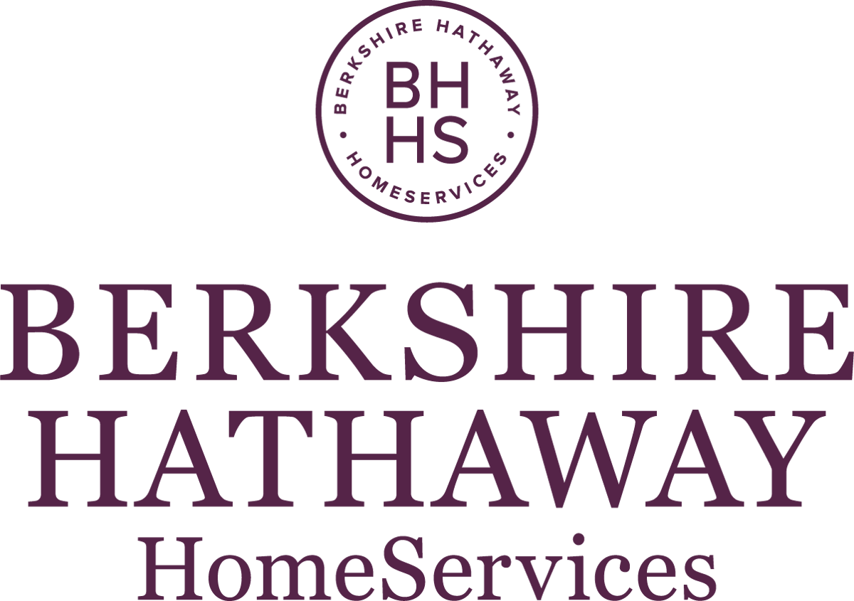
Established in 2013 as part of Warren Buffett’s Berkshire Hathaway conglomerate, the brokerage has grown into one of the largest in the US. Its branding reflects the financial strength and values of its parent company.
2. Century 21
-
Why I love it:
In March 2018, Century 21 rebranded to bring fresh air into the decades-old franchise. The company’s logo has undergone many renditions since its inception, and it now features sleek, minimalist typography. It feels bold yet modern, which showcases how a brand can evolve without losing its identity, and is a great example of a classic company stepping confidently into the future.
The company, which was founded by Art Bartlett and Marsh Fisher in Orange County in 1971, has grown significantly through its franchise model. It has been acquired several times, including by MetLife in 1985, and is now a subsidiary of Anywhere Real Estate (since 2006).
3. Coldwell Banker
-
Why I love it:
Its North Star logo, which was part of the 2019 rebrand to symbolize direction and leadership, combines heritage with a crisp, modern design that communicates guidance and trust. The bold “CB” with the star signals that the brand is approachable and authoritative. It’s also versatile in that it can be used on a variety of marketing materials, from business cards to billboards.
While both Coldwell Banker and Century 21 have undergone recent rebrands to adopt a modern design, the former’s new logo draws on its heritage by introducing the star, a symbol that emphasizes leadership and guidance. The latter, on the other hand, signals sophistication and style. Both are great fresh takes on the legacy brands.
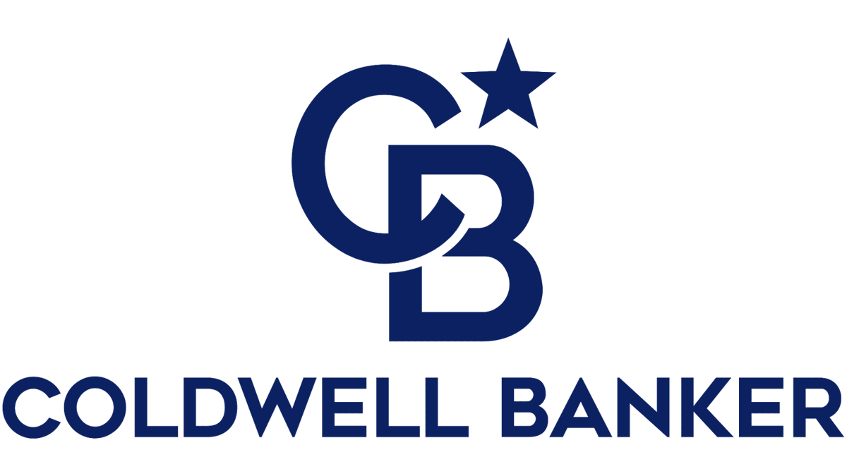
Coldwell Banker was established in San Francisco in 1906 after the great earthquake, when Colbert Coldwell witnessed families trying to rebuild their lives. At over a century old, the company is one of the oldest and most respected brokerages in the US.
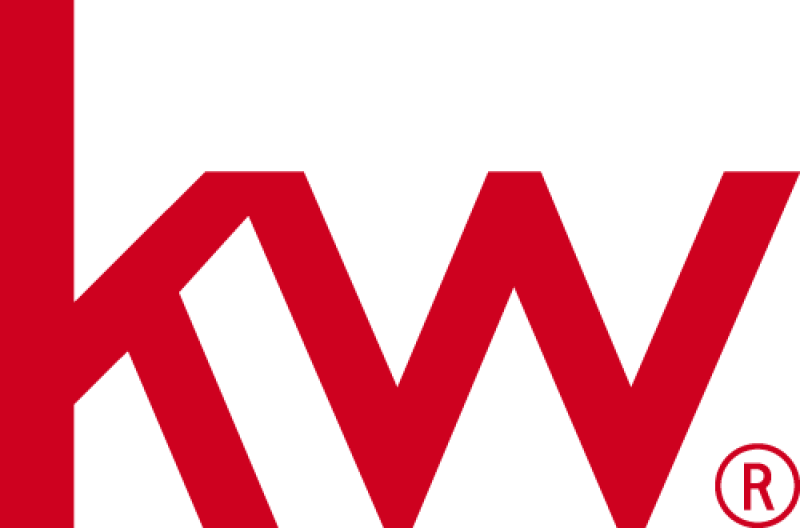
4. Keller Williams
-
Why I love it:
It proves that simplicity is powerful. The clean, red typography is recognizable, giving a bold presence. The minimalist design allows both employees and customers to feel trust in the brand, something that’s necessary in such a competitive industry. The bold, red “kw” mark is a symbol of its global presence and agent-focused model.
Gary Keller and Joe Williams founded Keller Williams in Austin in 1983. The company quickly became one of the world’s largest real estate franchises, with branches in Africa, Asia, South America, Europe, and more.
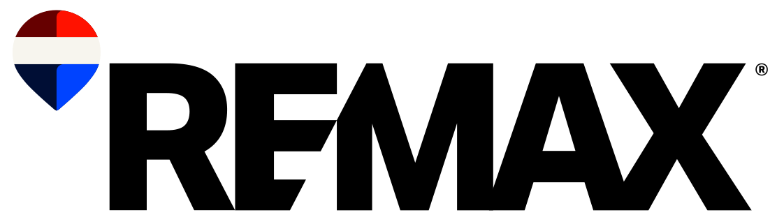
5. RE/MAX
-
Why I love it:
It is memorable, playful, and has enough color to make it stand out. Its hot air balloon, debuted in 1978, is one of the most iconic visuals in the industry — and for good reason. It has become synonymous with the brand, which symbolizes upward momentum and global reach.
Founded by Dave and Gail Liniger in Denver in March 1973, RE/MAX revolutionized the industry with its agent-centric model. It rewarded top-performing agents with high commission splits, empowering them to grow their businesses. That approach set the stage for its global expansion, as it now operates in over 110 countries and territories, including Europe and Asia.
Modern innovators
These companies lead on app-friendly marks, fresh typography, and simplicity, with logos that appeal to younger or digitally savvy clients and agents.
6. Reonomy
-
Why I love it:
Showcasing the brand’s identity as a CRE tech platform, the logo is sleek and data-driven. Its clean design communicates clarity and innovation, values that are critical in the proptech space. Its simplicity reinforces tech-forward positioning, and since the logo doesn’t rely on traditional real estate imagery, it stands out as an innovator. It also uses lowercase letters, a rarity amongst real estate logos.
Reonomy was founded by Charlie Oshman and Richard Sarkis in New York City in 2013. It was launched as an AI-powered data platform for the CRE market and aimed to solve the problem of accessing property data to enable more informed decision-making.
7. Compass
-
Why I love it:
It is one of the smartest logos, with the “O” doubling as a compass arrow. It is subtle, clever, and reflects the company’s mission to guide clients with innovation. It uses a sans-serif font and uppercase letters, ideal for a tech-forward company.
The company was launched in 2012 in New York City by Ori Allon and Robert Reffkin. Its history is marked by its focus on leveraging technology to streamline the real estate process for buyers, sellers, and agents. It quickly became a disruptor with its sleek branding and tech-first approach.
8. SERHANT.
-
Why I love it:
It showcases precisely who and what company it represents. Its bold, all-caps typography capped with a period makes for a powerful statement, reflecting the confidence and media-savvy personality of its founder. The period also reflects decisiveness. Overall, it’s a logo that feels more like a modern lifestyle brand than a brokerage.
Both the logos of Compass and SERHANT. use typography-forward designs and reflect confidence and a tech-friendly identity. However, Compass’s uses subtle symbolism to whisper understated cleverness, whereas SERHANT.’s takes the opposite approach with bold all caps and a period, projecting a strong personality.
Ryan Serhant, one of the top 12 most famous real estate agents, established SERHANT. in New York City in September 2020. His content-to-commerce brokerage leverages his established background as a top performer in real estate. It uses organic content for lead gen and brand building with a highly engaged community via innovative content creation and a mobile-first approach. Its offerings include media services and sales education.
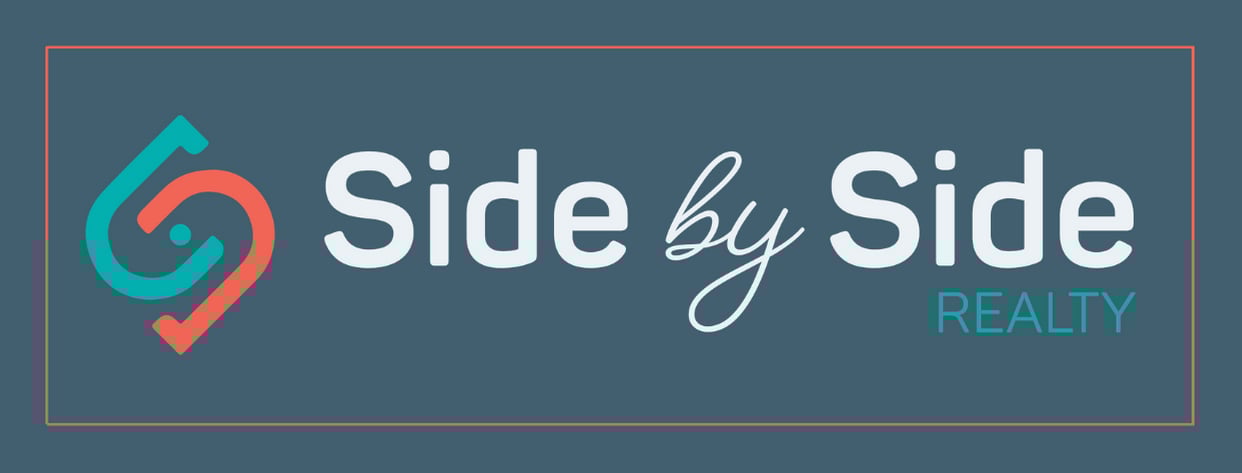
9. Side By Side Realty
-
Why I love it:
It reflects collaboration at its core and showcases the company’s identity of teamwork and accessibility. The branding reflects the mission to serve clients and agents with equality, and the use of color makes it stand out. The blend of the approachable name and modern design emphasizes the idea of partnership, making clients feel that they have a trusted ally.

Founded in 2019 by Scott and Drew Hoefler, Side By Side Realty is a newer brokerage emphasizing partnership and support. It is based in Minneapolis and aims to help clients achieve financial freedom through investing. As such, it specializes in investment-focused real estate, including single-family homes, small multifamily properties, and commercial buildings.
Luxury brands
In this section, you’ll see logos that communicate heritage, exclusivity, and elegance. They use sophisticated fonts, subtle marks, and restrained palettes.
10. Corcoran Group
-
Why I love it:
It embodies understated elegance and looks timeless. Its clean design ensures versatility in both print and digital materials. The simplicity whispers luxury, showcasing the brand’s reputation for sophistication and exclusivity.
Corcoran Group, which has one of the top must-read real estate blogs, was established in 1973 by Barbara Corcoran in New York City with a $1,000 loan. The firm has become synonymous with high-end real estate and has expanded via a franchise network. It targets properties and serves urban, suburban, and resort markets in the US and the Caribbean.
11. Douglas Elliman
-
Why I love it:
The refined typography gelled with a sophisticated aesthetic makes it perfect for high-end markets. The logo strikes the perfect balance between tradition and modernity, communicating that the company is deeply rooted in history but not stuck in the past. Its branding feels elevated, which mirrors the firm’s reputation for professionalism and reflects a century-long legacy in luxury markets.
Note that Corcoran Group and Douglas Elliman’s logos both rely on refined typography rather than heavy symbols and convey sophistication for high-end clients. Corcoran’s, however, feels boutique and elegant, while Dougal Elliman’s updated design showcases a historic name with a fresh design to show adaptability.
Douglas L. Elliman founded the brokerage in New York City in 1911, making it one of the oldest brokerages in the US. Today, it is a tech-driven firm with a global network, offering a range of real estate services and investing in proptech.
12. Hilton & Hyland
-
Why I love it:
Its mirrored “H”s are clever and elegant, symbolizing partnership and balance as the brand’s foundation. The subtlety of the mark also showcases confidence, reinforcing that prestigious and luxury branding doesn’t need to be overdesigned. The symbol can be used as a standalone representation without the surnames being spelled out. Overall, the logo is versatile, ensuring that it will do well on everything from stationery to billboards.
In 1993, Rick Hilton and Jeffrey Hyland, two prominent real estate names, founded the firm as a Beverly Hills-based luxury boutique focused on high-end properties. It was recognized for its exclusive service and ethical practices, and it expanded to become a leader in the LA market. After Hyland’s passing and Hilton’s departure, Lori Hyland, Jeffrey’s widow, became the company’s sole owner.
13. Naftali Group
-
Why I love it:
It uses the contrast of bold lettering to emphasize the company’s prominent surname, and it also uses minimalism to its advantage. The simple typography indicates that the brand values precision and sophistication, setting it apart as a global design-driven development and investment firm. The logo is built to resonate with discerning clients.
The Naftali Group was established in 2011 by Miki Naftali. It focuses on luxury residential projects in New York City and has achieved market-leading prices and a sales pace that sees most projects sell out before construction is complete. Its branding is refined and confident, reflecting the firm’s emphasis on architectural excellence.
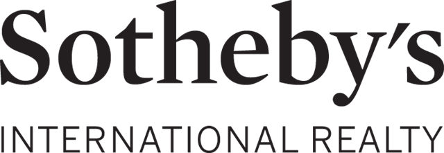
14. Sotheby’s International Realty
-
Why I love it:
The brand benefits from the legacy of one of the world’s most prestigious action houses — and its logo reflects that connection. The typography is elegant, and the design understated, immediately signaling luxury and heritage, and the branding underscores the company’s heritage of prestige and refinement. Overall, the logo feels timeless and reinforces the firm’s global reach.
Sotheby’s International Realty was founded in 1976 as a real estate service for Sotheby’s clients. The company now serves as a luxury firm that connects independent brokerages with high-net-worth individuals. It is known worldwide, with offices in multiple countries, including those in Asia, Australia, and Europe.
15. The Oppenheim Group
-
Why I love it:
It is sleek and contemporary, and its refined typography projects exclusivity while staying approachable. The logo makes no mention of “brokerage,” “property,” or “real estate,” which is ideal, as the firm is involved in more than just buying and selling. Plus, the colors used underscore simplicity and professionalism, and the red “O” is a clever nod to the two owners’ surnames.

The company is one of Los Angeles’ oldest brokerages, with its history tied to the Oppenheims’ five generations in the industry. Stern Realty Co. was founded in 1889 by Jason and Brett Oppenheim’s great-great-grandfather, Jacob. In 2013, the twins founded the current Oppenheim Group, whose branding became even more recognizable after its media exposure on Netflix’s “Selling Sunset.”
Boutique independents
The brands here thrive on personality, creativity, and community appeal. Their logos showcase individuality, storytelling, and lifestyle branding.
16. CORE Real Estate
-
Why I love it:
Reflecting the company’s New York City roots is the bold and urban logo. It projects energy and confidence, especially with its pop of color, which stresses the first letter of the founder’s surname. It entices people to inquire because it excludes “real estate,” “properties,” or any slogans to showcase what the brand does. Overall, the firm’s branding feels as contemporary as the skyline it represents.
CORE Real Estate is a New York-based brokerage that was established in 2005 by Shaun Osher. It was built around boutique luxury marketing and is known for its deep market knowledge and ability to market high-end properties, especially those in Manhattan. Its edgy branding matches the firm’s focus on high-end urban living.
17. Halstead
-
Why I love it:
It looks professional yet still feels friendly, and its distinctiveness makes it stand out. The architectural “H” blends real estate imagery and functional design, and the clear, modern typography complements the icon. The logo embodies Halstead’s brand values as modern and evolving.
In 1984, Halstead, a residential brokerage firm, was founded by Clark Halstead and Diane Ramirez in New York City. The idea for Halstead Property was first created on a napkin by Clark, who then pitched it to an investment group. The company gained a reputation as a pioneer in the industry, being first to introduce computers into operations and develop game-changing sales and marketing concepts. It was known for its forward-thinking approach before it merged with Brown Harris Stevens in June 2020.
18. Nest Realty
-
Why I love it:
The simple yet fun design communicates professionalism with a touch of whimsy. The clean wordwork makes it extremely easy to read and recall. The logo uses a muted color palette and a straightforward yet creative design to avoid clutter, keeping the focus on the brand name itself. It’s a great example of how branding doesn’t need to rely on complex graphics.
Keith Davis, Jim Duncan, and Jonathan Kauffmann established the full-service real estate brokerage in August 2008 in Charlottesville — and in Jonathan’s unfinished basement, nonetheless. It grew into a boutique brokerage with a community-first approach, as seen in its branding, which reflects the concept of “home” as a sanctuary. The firm specializes in residential, farm, estate, and commercial properties, with a strong focus on tech, customer commitment, and innovative marketing.
19. The Agency
-
Why I love it:
It subconsciously emphasizes the firm’s role in real estate and epitomizes modern design, featuring a sleek “A” symbol and a minimalist wordmark. It is confident and media-ready. Plus, it’s impossible to miss, which is exactly the point for a brand with a strong lifestyle presence. The bright red conveys the energy of the company’s vigorous approach to its real estate projects.
The logos of Nest Realty and The Agency seem similar; however, the former’s muted colors create approachability and warmth, reinforcing its community-first philosophy. Meanwhile, the latter takes the opposite approach, using striking red to grab attention, reflecting its bold, media-driven approach to luxury real estate.
The luxury brokerage with a global reach was founded by Mauricio Umansky, Billy Rose, and Blair Chan. Launched in Los Angeles in 2011, it offers a collaborative approach to real estate, fostering a culture of partnership where agents share resources, such as expertise and contacts. That, in turn, gives clients a competitive edge and better representation.
Commercial giants
The logos you’ll find here focus on professional strength and authority, as the brands represent corporate real estate and development. They communicate stability and authority, perfect for large-scale firms.
20. Cushman & Wakefield
-
Why I love it:
It is bold and modern, and its striking red icon resembles an abstract skyline. The angular design looks dynamic, symbolizing growth and progress. The strong icon complements the clean wordmark, and the overall look conveys a global scale while feeling fresh and forward-looking.

Established in 1917 in New York City, what began as John Clydesdale Cushman and Bernard Wakefield’s small property management firm grew into one of the world’s largest CRE services companies. After its September 2015 DTZ merger, the brand adopted the logo you see above to reflect its new global identity. Today, it operates in over 60 countries, and its branding reflects strength and modernity.
21. Jones Lang LaSalle
-
Why I love it:
The rebranded monogram reflects the firm’s global scope. It is corporate and professional, and the rounded design softens the bold wordmark, making it authoritative and approachable. Serif fonts are traditionally associated with authority, stability, and professionalism, qualities that clients seek in real estate companies managing billions in assets.
While both Cushman & Wakefield and JLL logos use bold red to signal authority and strength, their design choices communicate different brand messages. The former employs sharp, angular shapes that resemble a skyline, which could symbolize progress and growth. In contrast, the latter’s rounded monogram softens the corporate look, making a massive, centuries-old firm feel approachable and client-friendly.
JLL’s roots go back to a London auction house founded in 1783. After centuries of growth and the 1999 merger of Jones Lang Wootton and LaSalle Partners, the firm has become a global CRE and investment leader. It operates in over 80 countries and drives innovation through expansion and tech partnerships.
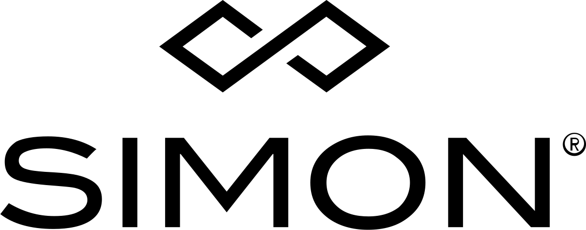
22. Simon Property Group
-
Why I love it:
It is elegant and timeless, making it versatile across various mediums, from digital platforms to physical signage. The infinity-like symbol could also represent the letter “S,” which is rather clever. The sleek, modern font complements the symbol, producing a cohesive and contemporary look, and the overall design emphasizes professionalism.
In 1960, Herb and Melvin Simon established the firm, which grew from strip malls in Indiana to a public REIT in 1993. It expanded through major deals like the 1996 DeBartolo merger and the 2007 Mills acquisition. Under CEO David Simon, it has become a retail real estate powerhouse and is the largest owner and operator of shopping malls in the US. Its straightforward branding underscores its corporate dominance.
Related Articles
- 18 Clever Real Estate Marketing Ideas in 2026
- 120 Real Estate Company Names & How To Create Your Own [+ Generator]
- The 15 Best Realtor Business Card Ideas & Examples
How to create the best real estate logos
Creating a logo is an exciting opportunity to reflect your company’s unique identity and values. By following this process, you can create an effective real estate logo for use across your marketing materials and leave a lasting impression.
- Step 1: Understand your brand. Before diving into design, clearly define your mission, values, and target audience. A logo is not just decoration — it should encapsulate what your business stands for and communicate it instantly. Consider whether you want to project luxury, approachability, modern professionalism, or a community-driven focus, and let that guide every design choice.
- Step 2: Keep it simple. The strongest logos are clean and uncomplicated. A simple design is easier to recognize, recall, and reproduce across different mediums, from yard signs to business cards to digital ads. Focus on one strong wordmark or symbol, avoid unnecessary details, and aim for clear lines that deliver a direct message.
- Step 3: Prioritize versatility. A great logo works everywhere. Test it in black and white, shrink it to the size of a website favicon, and scale it up for billboards, ensuring it remains effective at any size. Consider creating horizontal and stacked variations for different formats.
- Step 4: Choose fonts with purpose. Typography plays a major role in brand personality. Whatever you choose, prioritize legibility across print and digital contexts.
- Serif fonts suggest tradition, sophistication, and luxury — ideal for high-end agencies.
- Sans-serif fonts are modern, approachable, and professional, making them a safe choice for broader markets.
- Step 5: Use color psychology. Colors aren’t just aesthetic. They evoke emotion and influence perception. So, select a palette that aligns with your brand identity, and stick to two or three colors for consistency and recognition.
- Blue: Trust, professionalism, reliability
- Green: Growth, eco-friendliness, wealth
- Black/gold: Prestige, exclusivity, sophistication
- Red/orange: Energy, urgency, warmth
Additionally, different background fields can dramatically affect how people perceive a logo’s color (e.g., a blue that signals “competent” on one background can appear “sad” on another), according to the Journal of Consumer Research.
- Step 6: Leverage symbolism and negative space. A distinctive symbol can reinforce your brand’s message. Incorporate local elements like skylines or landscapes to tie your brand to your market. Be mindful of negative space — clever use of empty areas can add memorability while keeping the design uncluttered.
- Step 7: Aim for timelessness. Your logo should look as strong five years from now as it does today. Avoid overly complex effects and fleeting design trends, such as minimalism taken too far, where lines are so thin that the logo disappears at smaller sizes, trendy decorative script fonts, or ultra-condensed typefaces that are hard to read and don’t age well. Stick with clean forms and balanced typography.
- Step 8: Get professional input. Consider hiring a skilled designer to translate your vision into a polished design. Professionals can ensure your logo meets technical standards, performs well in different applications, and stands out against competitors through comparative analysis.
One place you can get logo design assistance is Fiverr. Whether you are looking for a sleek and modern design or a more traditional and sophisticated logo, it gives you access to a pool of freelancers with varying styles and expertise. You can browse through portfolios, read client reviews, quickly understand the costs, and communicate directly with designers to ensure your logo vision is realized.
Visit FiverrCommon pitfalls to avoid when designing your logo
When designing a real estate logo, it’s just as important to know what not to do. Certain visuals and design choices are so overused in the industry that they fail to differentiate your brand and may even make you look generic.
I recommend that you focus on originality and meaning rather than literal representation. Abstract shapes, custom typography, local cultural influences, or symbolic forms (like circles for community or arrows for progress) can make your brand more distinctive while still feeling relevant to the real estate industry.
Here are a few clichés to watch out for:
- Generic rooflines and houses: The classic peaked roof or full house silhouette is everywhere. While they clearly connect to real estate, they rarely stand out and often look like clip art.
- Literal keys and doors: Keys are meant to symbolize ownership, but because they’re so common, they’ve lost their impact. Doors have the same problem: they feel obvious and uninspired.
- Overly detailed illustrations: Logos that try to include windows, chimneys, trees, or entire buildings can look cluttered and become illegible at smaller sizes.
- Trendy design fads: Heavy gradients, 3D effects, or ultra-thin typography might look stylish today, but can quickly date your logo. Timelessness is a safer investment.
- Too many elements at once: Combining multiple icons (e.g., a roofline, a key, and a handshake) makes the design busy and hard to interpret. A strong logo communicates with restraint.
Frequently asked questions (FAQs)
A real estate logo establishes your brand identity, conveys professionalism and trust, and sets you apart from competitors. A strong one boosts recognition, making it easier for clients to remember and choose your services.
Ideally, you should have one primary logo for consistency, with variations (like simplified or monochrome versions) for different formats. All variations should keep the core elements to maintain a cohesive brand image.
When choosing logo colors, focus on the emotions they convey. For instance, blue suggests trust and professionalism, while green represents growth and sustainability. Pick colors that resonate with you and align with the message you want to communicate to your audience.
Reference:
[1]Adobe | The Top Color Trends for Branding in 2025
Related Articles