


A killer real estate website isn’t just about web design—it’s also about creating an experience that makes visitors take action. Your website should prompt visitors to contact you, schedule a showing, or stay engaged rather than leave. Think of your website as a digital storefront showcasing your latest offerings. If you want a solid real estate web design and want to convert more leads into clients, I have listed several tricks to boost your website. Let’s dive in!
Why Real Estate Web Design Is Important
Many have experienced stopping browsing a page just because its real estate web design was visually unappealing. Yup, it happens. Web design for real estate agents is essential because it influences visitors’ decisions on whether they’ll return or check out another agent. Your page’s web design affects user experience, audience perception of your brand, and what steps they’ll take next. Whether or not they leave you contact information may depend on your real estate web design.
- Top Real Estate Web Design Tips
- 1. Choose the Right Website Builder
- 2. Use Heatmaps to Find Out Where Visitors Click
- 3. Create a Lead Capture Form
- 4. Keep Your Site Navigation Tools Straightforward
- 5. Pay Attention to the Style & Copy on Your Call-to-Action Buttons
- 6. Put Up a 3D Virtual Home Tour
- 7. Use a Live Chat Function for Instant Replies
- 8. Adapt Your Website to the Post-NAR Settlement
- 9. Ensure Your Website Is Optimized for All Devices
- Frequently Asked Questions (FAQs)
- Bringing It All Together
Top Real Estate Web Design Tips
If you’re curious about what makes a good website, I put together some of our top fool-proof tricks to make your real estate web page design stand out.
1. Choose the Right Website Builder
When choosing a real estate website builder, consider your needs and preferences as an agent. If you need a commercial real estate web design, ensure the builder can accommodate it. The website builder should also have many templates that match your style. In addition, a good real estate web design company should have top-notch customer service, especially since you’ll need to talk to them when things get complicated. Here are some things to consider when choosing a website builder:
- Budget: While some website builders are free, they might come with limitations. So, whether you are going the DIY route or hiring a professional web developer to do the job, consider how much you’re willing to pay upfront versus how much you’ll spend when you want more website add-ons later.
- Ease of use: Unless you knew how to code in your past life or enjoy figuring out complicated site builders, you should consider ease of use in your criteria. Look for a website builder that’s easy to set up, intuitive, beginner-friendly, and features drag-and-drop templates.
- Customization options: Consider how much freedom you will have when tweaking your site’s style, features, layout, and colors. The more control you have over customizing the real estate web page design, the more your site will stand out from the competition.
- Social media integration: When choosing a builder, check if it features social media integration. A great website builder allows users to share site content on social media and follow social media pages from the website. This website builder feature allows more people to see your profile and content.
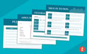
AgentFire is a powerful website builder that allows you to create IDX websites with essential add-ons you didn’t know you needed. Whether you need a commercial or luxury real estate web design, AgentFire will provide excellent band-focused landing pages, lead capture forms, and a stunning home page to convert visitors into clients.
Visit AgentFire2. Use Heatmaps to Find Out Where Visitors Click
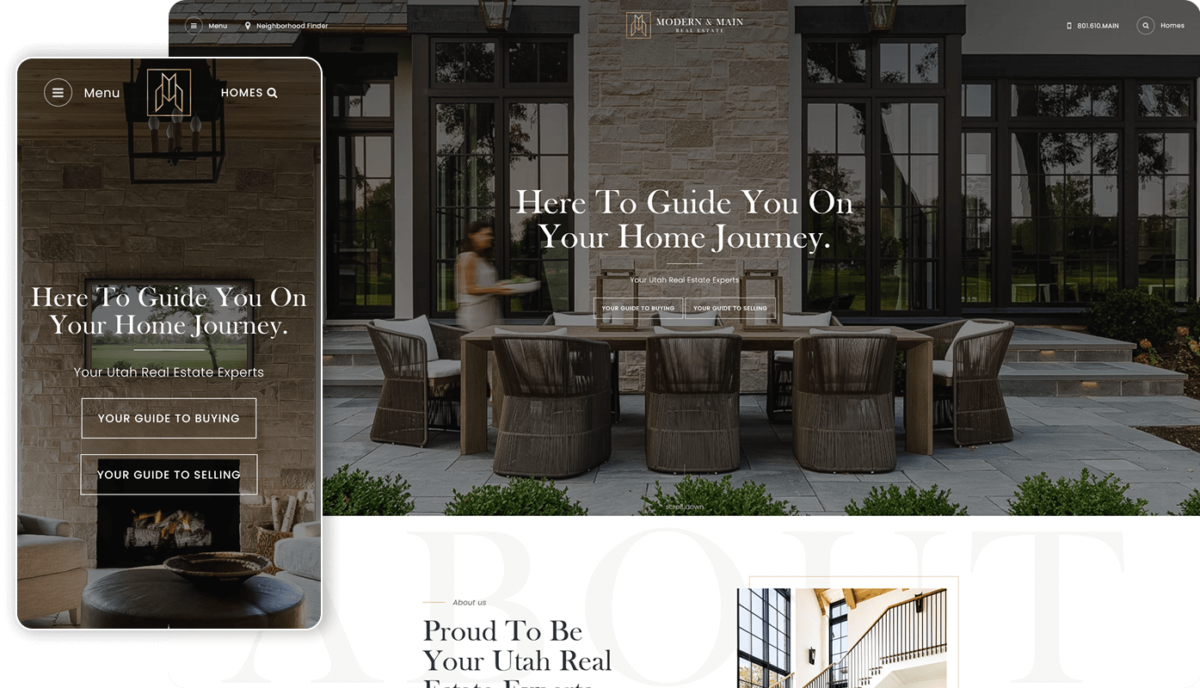
One of the trickiest things to do when creating your real estate website design or landing page is figuring out where your visitors seek information. If many things are happening on your website, heatmap software lets you track exactly where your site visitors click and navigate.
To get started, sign up for a service like Crazy Egg or Hotjar and add pages from your site that you want to track. After a month, the software will create a heatmap showing the average location of all users’ navigation and clicks. Parts of the website where users click or navigate too often are represented in red, while areas where they click or navigate less are in yellow, green, and blue.
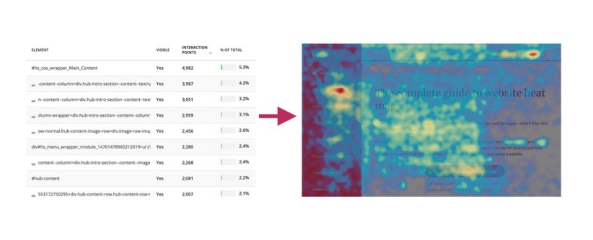
Using the heatmap’s data, you can tweak your layout, copy, and site colors to enhance navigation and subtly encourage your visitors to take a specific action. Depending on what you’ve decided that action is, this can mean signing up for an email list, entering their address, or browsing your property listings.
3. Create a Lead Capture Form
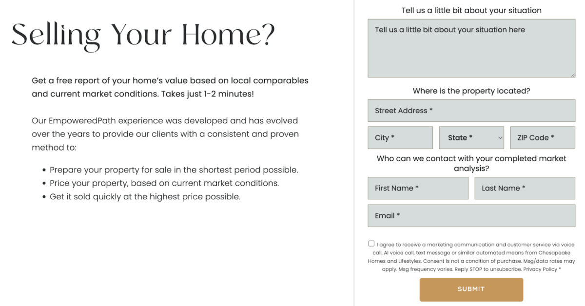
A lead capture form on your website is essential for gathering information about your site visitors. Ask for their name, mobile number, and email address so that you can contact them and start a conversation. Websites that convert leads to clients usually offer a free home valuation or market insights in exchange for the lead’s contact information. Ensure your lead capture form is in a strategic part of your website: it can be within the landing page as a pop-up or at the bottom of an auto-scroll landing page.
4. Keep Your Site Navigation Tools Straightforward
Make your website easy to navigate. Stick to straightforward labels on your menu like “Properties,” “Current Listings,” or “Community Guides.” Trust me, you wouldn’t let a potential client open so many pages and scroll endlessly, trying to find what they’re looking for. Some essential pages you may include on your website are:
- Navigation bar or menu with organized categories
- Quick links (social media sharing buttons with your pages linked)
- A search bar
- Footer with About Me, Contact Us, and FAQs linked
5. Pay Attention to the Style & Copy on Your Call-to-Action Buttons
Believe it or not, even the buttons you use on your call-to-action (CTA) can significantly impact your conversion rate. Subtle color, shape, and copy changes on your buttons can mean more leads and more closed deals. If you want to improve your CTA buttons, here are some valuable tips:
- Orange, green, and blue buttons seem to convert the highest.
- Buttons whose color contrasts nicely with the background color convert well.
- Ensure they are actual buttons, not just text links!
- The buttons should have specific action words in their copy: “Get My Home Value” or “Download My Free PDF” will work better than “Submit” or the dreaded “Click Here.”
- Keep your heatmap’s data in mind. If users don’t scroll too far on your site, don’t put the button somewhere they won’t see.
6. Put Up a 3D Virtual Home Tour
Besides using professional photos and videos across your site, adding a virtual property tour can enhance the visitor experience further. A 3D virtual tour lets potential buyers see the property at their own pace, exploring every room without leaving their couch. It’s like giving them an open house tour without the small talk. Putting up a virtual tour on your website will keep visitors on your page as they scroll and zoom through each photo.
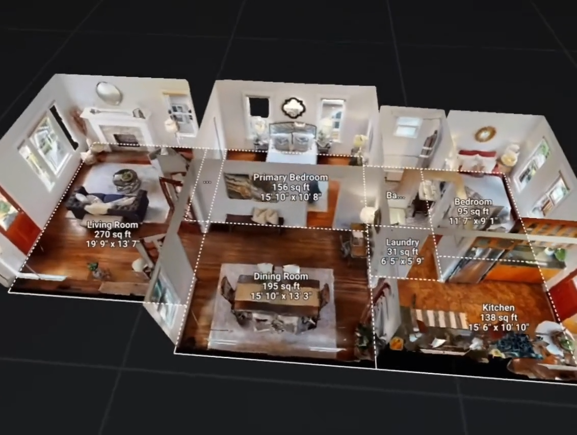
If you’re considering adding a 3D virtual property tour on your website, Matterport is an excellent virtual tour software. With Matterport, you can add a compass, a mini-map, and detailed descriptions of each room. It’s also one of the few virtual tour software programs that offer a free plan to test its capabilities as long as you need.
Visit Matterport7. Use a Live Chat Function for Instant Replies
Integrating a real estate chatbot on your website lets you respond to potential clients in real time, even when you’re offline and busy attending to your personal affairs. With chatbots, you can set up automated responses to simple questions like “How do I schedule a showing?” or “Do you have upcoming open houses?” Best of all, using a live chat service is like having a virtual assistant that helps keep the conversation going.
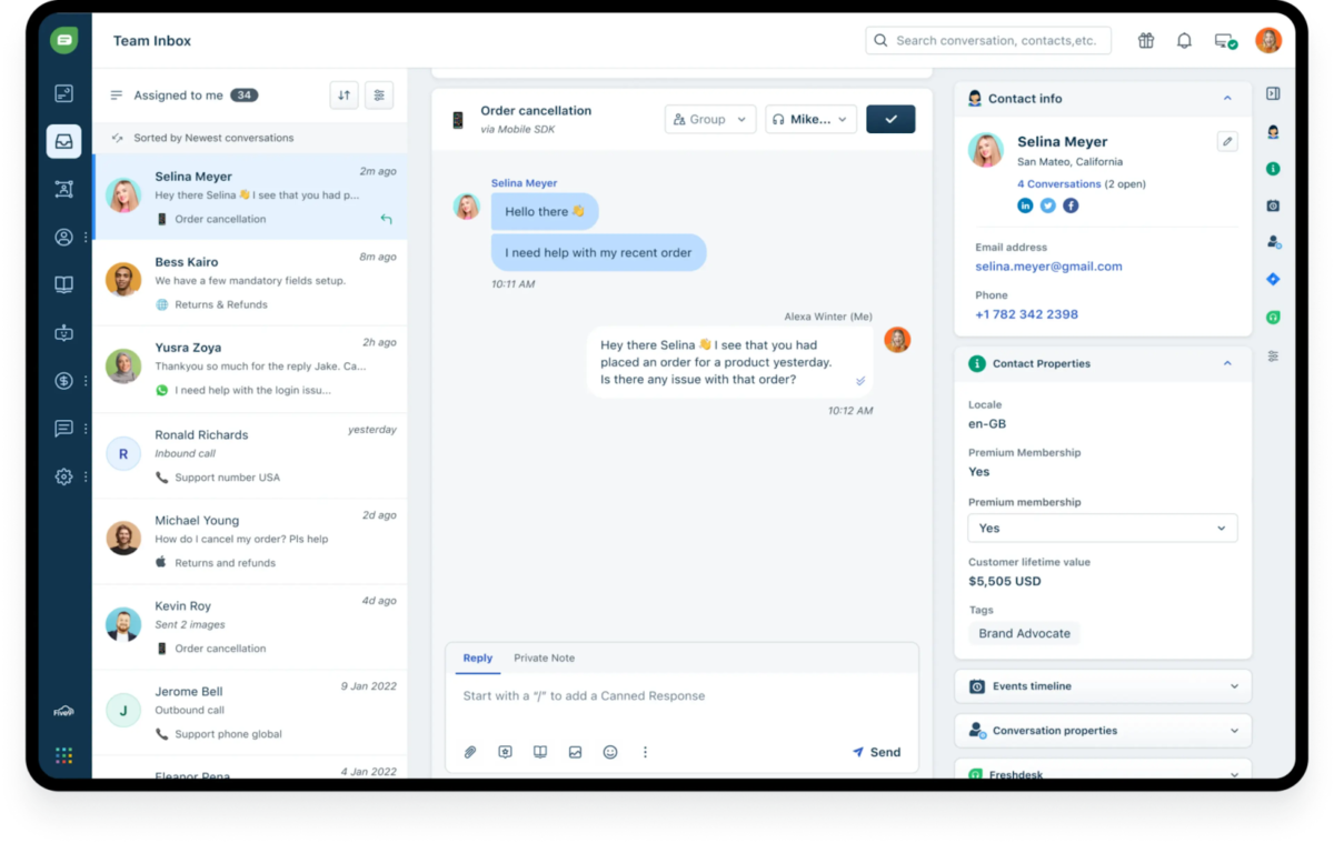
While a live chat service is an added expense, there are also many free ones. Freshchat is live chat software you can integrate into your website, social media, or mobile app. It offers a free plan for up to ten agents. With Freshchat, you can engage website visitors and quickly answer their inquiries by setting up automated responses.
Visit Freshchat8. Adapt Your Website to the Post-NAR Settlement
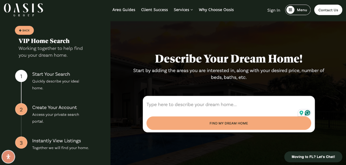
With the recent National Association of Realtors (NAR) settlement, it’s more important for agents to create websites that prioritize transparency. According to AgentFire, here are some best practices you can adopt to come up with the perfect post-NAR settlement website:
- Integrate Calendly into your website so visitors can easily schedule a showing or set up an appointment.
- Show off your client testimonials and awards and highlight key stats like the number of properties sold, transactions made, and year-to-date sales.
- Instead of the old generic home search, make it a “VIP home search” where visitors can give a specific description of the property they’re looking for, allowing you to give a tailored recommendation.
9. Ensure Your Website Is Optimized for All Devices
With most users now accessing websites from smartphones, your site must perform flawlessly on mobile devices. Ensure the design is responsive, adjusting to fit any screen size. Most website builders offer the ability to optimize the site for mobile devices. In addition, mobile optimization also impacts search engine rankings, significantly enhancing your website’s visibility.
Frequently Asked Questions (FAQs)
The best real estate website builder depends on your budget and business goals. If you want an affordable and customizable builder, try AgentFire. If you’re after a concierge service, there’s Placester. If you’re catering to a high-end market, check out Agent Image. If you want an easy-to-use builder with drag-and-drop features, try Wix or Squarespace.
To make your real estate website stand out, keep your site’s graphic design consistent, keep CTA buttons interesting, make all navigation tools and labels straightforward, and use only high-quality images. Check out our article on the top real estate agent websites to learn more tricks about making your website stand out.
Agent Image’s templated websites start at $99, while custom pricing starts at approximately $1,500. If you’re in the luxury real estate market and prefer white-glove service, you’ll have to pay a hefty price for a fully customized website.
The best social media platforms for realtors are Instagram, TikTok, Facebook, LinkedIn, YouTube, Pinterest, and X (formerly Twitter). With these social networks, agents can share their listings, promote their websites, convert leads, and expand their business.
Bringing It All Together
You don’t have to be a web designer for real estate to develop a solid website. Whether hiring a professional to do the job or using a template to drag and drop your website content, always incorporate the latest industry changes and focus on user experience. By combining all the tricks I’ve listed above, you’ll be well on your way to creating the best real estate web design tailored to your potential clients’ needs.